

Simplifying the understanding of supplementary health insurance offers for an insurance provider

Our Approach
Two product range logics, one central question of clarityand trust
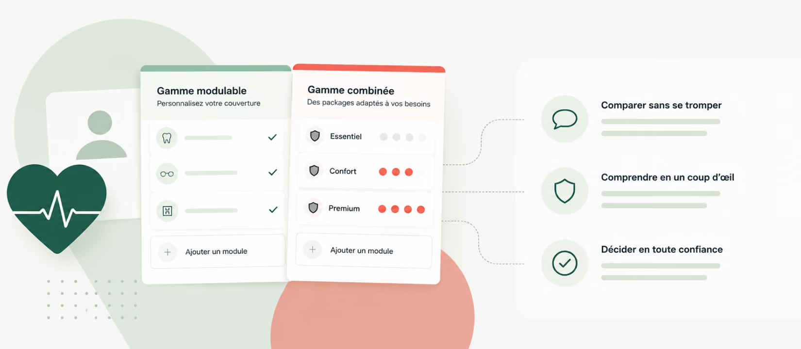
The studycompared two approaches: a simplified range that could be customised withmodules, and a combined offer proposing packages with optional modules. Thefocus was not only on understanding “on paper”, but on the ability to projectoneself without stress: what is quickly understood, what can be comparedwithout errors, and what reassures customers when they are ready to commit. Theobjective was to secure the redesign directions before moving forward with thecreation of the supplementary health insurance range.
Representative recruitment, including customers andnon-customers
20 remoteindividual interviews of 60 minutes were conducted with participants aged 19 to50 who were responsible for their supplementary health insurance, evenly splitbetween customers and non-customers of the company. This diversity made itpossible to distinguish what was linked to familiarity with the brand from whatdepended on the structure of the offer itself.
A supplementary insurance range does not reassureby multiplying options, but by making comparison feel “risk-free” and the valueimmediately readable.
Prototypes to test before ambiguities become embedded
Participantsexplored two prototypes to evaluate the overall logic, the understanding ofmodules and the ease of comparison. This approach revealed ambiguity early:where vocabulary, architecture or presentation could complicate explanations,slow down decisions or introduce doubt.
Identifying support needs at the moment of choice
The studyclarified expectations for guidance and reassurance during decision-making:what information needs to be explained, at what moment and in what format. Thechallenge was to support different ways of making decisions, with adaptedjourneys for autonomous or assisted decision-making, without excluding part ofthe audience.
Actionable recommendations focused on structure andpresentation
Telonoformulated recommendations on the structure of the offer, the presentation ofmodules, vocabulary, different journeys and reassurance elements to integrate.The objective was to make the supplementary health insurance range easier tounderstand, easier to compare and more reassuring at the moment ofsubscription.
Simplificationhappens as much in UX as in editorial choices: reading order, wording,comparison cues and reassurance signals.
Key Benefits
Validated directions to move forward with the range redesign
The evaluation of the two product range logics reduced grey areas and made it possible to move forward on solid foundations for the next stage of the project.
Immediately actionable deliverables
A structured report and a summary of recommendations guided the design: range structure, experience principles, vocabulary and reassurance elements.
A clarified roadmap and aligned teams
A concrete basis to decide what to improve first, without starting from scratch, and a shared reference point to accelerate decisions between stakeholders.