
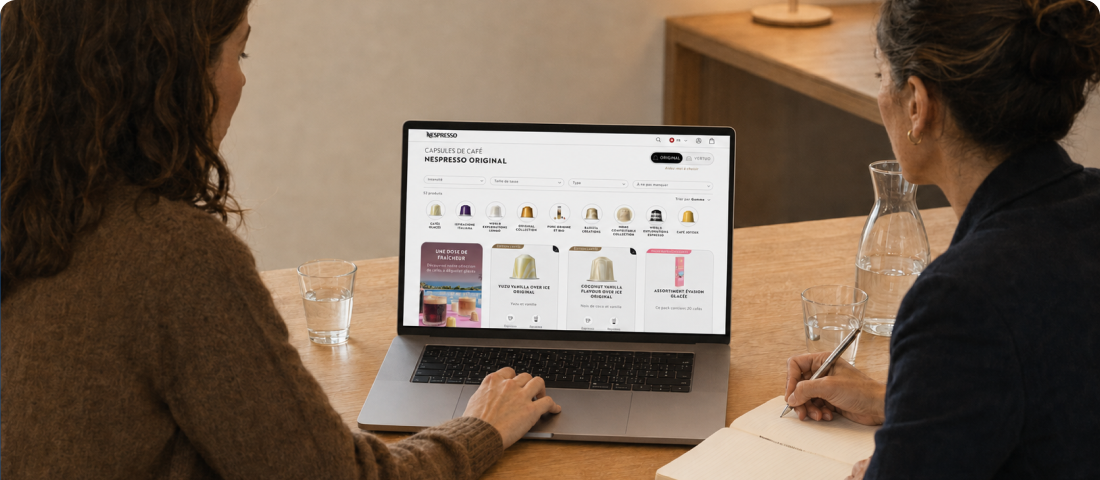
Reducing friction to speed up coffee ordering on the Nespresso Switzerland website

Our Approach
Concrete, real-life scenarios
The study focused on real user journeys rather than isolated screen tests. Two scenarios were selected to identify concrete tasks: for customers, quickly reordering their usual capsules; for prospects, creating an account and registering a machine after purchase.
A qualitative study at Swiss market scale
24 individual 60-minute sessions were conducted between Geneva with Telono and Zurich with a partner. Two profiles were covered: Nespresso customers with established purchasing habits, and prospects aged 25 to 35, smartphone users and non-members. This setup made it possible to address both the customers’ expectation of efficiency and the prospects’ need for clarity.
Every hesitation, even a minor one, can weaken the ordering experience and affect brand perception.
Comparing three versions of the journey
The core of the study was to compare the coffee ordering journey across three versions of the website: the current Swiss version, a responsive prototype based on an international market and adapted for the study, and an in-progress prototype tested on desktop. This comparison helped identify levers to concretely improve the customer experience.
A detailed observation of friction points
During the task-based tests, the analysis focused on sensitive points in the journey: access to ordering, readability of the product list, filters, special offers, product pages, adding to cart, cart access, login, cart comprehension and checkout. The goal was to identify what slows users down, what creates confusion and what reassures them when validating their order.
Think aloud and debrief to understand the “why”
Each session combined observation, live verbalisation and a synthesis questionnaire. This structure made it possible to collect data on both the efficiency and perception of the journey: what is considered clear, what creates doubt and what strengthens trust. The results from Geneva and Zurich were then consolidated to produce a complete and coherent report.
Concrete and realistic recommendations
The test results - including feedback on adding items to the cart, label consistency, visual accessibility, delivery information, quantity management, checkout readability, password creation and registration steps - were translated into actionable recommendations to help shape an optimal experience based on the most promising version.
User testing creates value when its results are used to define tangible improvements to the proposed experience.
Key Benefits
A clear comparative diagnosis across mobile and desktop
Strengths and limitations of the three versions of the “Order coffee” journey, with a structured reading of their impact on fluidity, readability and trust.
A solid basis for choosing the target version
Identification of a relevant direction, provided that the observed irritants are corrected to create tangible value.
A concrete improvement plan
Operational recommendations across different stages of the customer and prospect journeys, as well as on label consistency.
.avif)