
Clarifying health insurance discounts to support customer decisions

Our Approach
Making discounts clear and credible for customers
We began by exploring what policyholders really understood about the discounts, what they expected from them and how clearer information could shape perceptions of value, transparency and credibility. This established a simple benchmark: useful information should be effortless to understand, easy to verify and consistent with the amount due.
Bilingual research to capture different perspectives
We conducted bilingual qualitative research in French and German, with 11 remote individual interviews lasting 60 minutes each. Participants were policyholders receiving different types of discounts. The interviews revealed recurring sources of confusion as well as the wording and reference points that strengthened trust.
A discount needs more than visibility to be understood: customers must be able to see what it applies to and verify it, or it may raise suspicion.
Understanding when discounts influence decisions
The research identified when customers looked for and assessed discount information: when taking out or renewing a policy, receiving documents and comparing offers. It also put discounts in their proper place within the decision. Price, cover and service remained central, but a discount could tip the balance when its logic was clear and the saving shown in concrete terms.
Testing documents that show the saving clearly
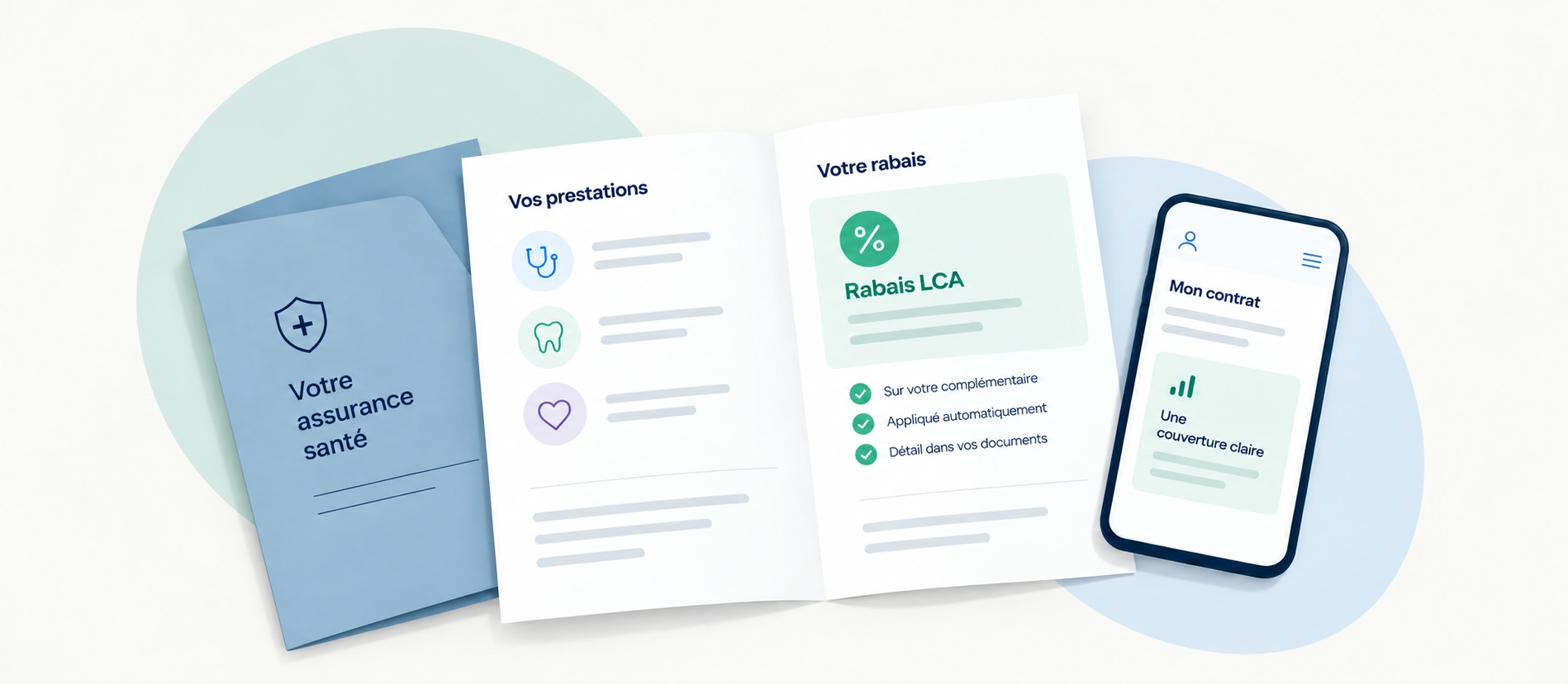
We evaluated several versions of policy and contract documents, including callout boxes, icons, summaries and highlighted figures. The aim was to test the legibility, comprehension and credibility of a more prominent presentation of discounts under realistic reading conditions: quick scanning, comparison and interpretation without jargon.
Actionable recommendations for a consistent multichannel experience
The analysis highlighted the most common sources of confusion: what the discount applied to, why it applied and how it was calculated. We therefore prioritised what would help immediately: a clear hierarchy, savings shown in CHF and an easy-to-follow calculation from initial price to discount to final price. These principles were designed to work consistently across letters and the app.
The saving becomes clear when the calculation fits on one line and the final price leaves no room for interpretation.
Key Benefits
More transparent discount information
A precise understanding of customer expectations and recurring confusion points made it possible to clarify the discounts and strengthen trust.
Tested, reusable visual principles
The document variants and presentation rules showed how to make savings visible, credible and immediately easy to understand.
Consistency across channels
Content and terminology recommendations created a consistent way to present discounts across letters and the app, using the same clear and comparable calculation logic.