
Designing a transport app passengers actually need
.png)
Our Approach
Align early, before design starts
We interviewed key stakeholders to clarify their view of use cases, passenger needs, and potential blockers. This first step created a shared baseline, surfaced the project’s priorities, and pinpointed where the app needed to deliver real value for passengers.
Market standards as a benchmark
In a highly competitive space, we analysed sector players to identify best practices, effective interface patterns, and opportunities to differentiate. This market read helped position the future MBC app against current passenger expectations - while keeping the specificities of a regional network front and centre.
In mobility services, value starts with one thing: clear journeys and fast access to the information that matters.
A new information architecture to simplify key journeys
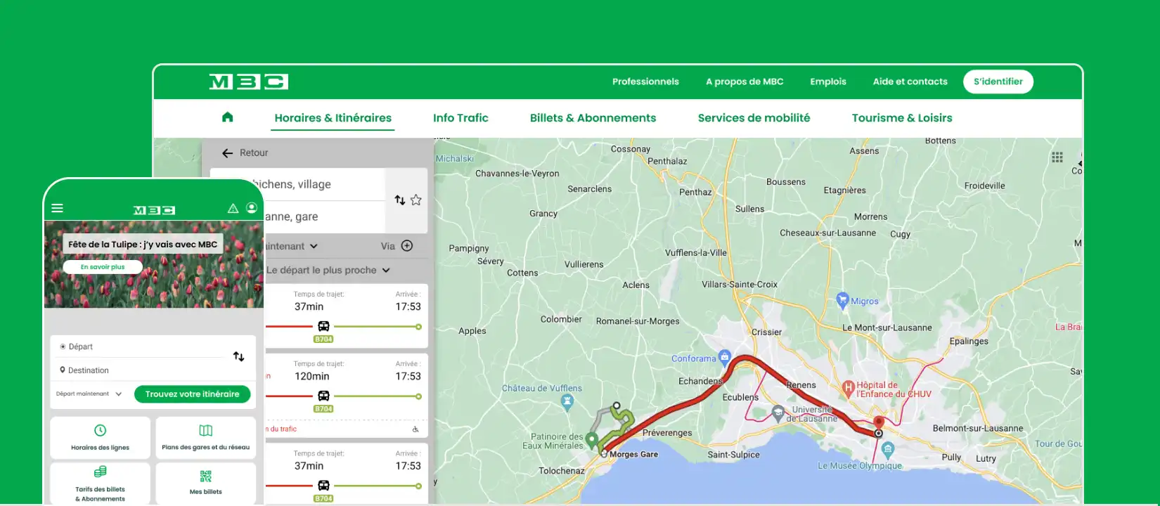
Building on these insights, we redesigned the information architecture and reworked the core flows for route planning and ticket purchase. The goal was to make journeys more intuitive, reduce friction, and organise information in a way that stays readable for a wide range of users.
Design grounded in real-world use
We designed the main mobile and desktop screens, leveraging the capabilities of a Progressive Web App (PWA). Prototypes let us test interactions, validate design principles, and refine the interface with users. Particular attention went to legibility and ease of use - especially for older audiences.
A great transport app doesn’t just inform. It helps people decide - and act - quickly.
Key Benefits
A clarified UX vision
A clear direction for the MBC app, aligning internal expectations with real passenger needs.
A more market-ready experience
A reworked architecture and streamlined journeys aligned with sector standards and user expectations.
A service validated with passengers
Design principles tested and validated with users - including older audiences - to ensure an experience that’s accessible and easy to understand.