
Clarifying Trianon’s client portal to make occupational pension management easier

Our Approach
Understand business constraints before redesigning the experience
We started by analysing the existing module and the specific challenges tied to occupational pension management. The goal was to capture the expectations of insured members - who are often not pension experts - as well as the business constraints, to build a solid foundation for the redesign.
Create a clear, shared view of the journeys to improve
Wireflows helped structure the key journeys and main screens, aligning teams on the steps that needed attention. This end-to-end view made it easier to prioritise the work and to secure decisions early in the project.
In complex environments, visualising journeys helps align stakeholders quickly.
Iterate through design to keep improving
Screens and interactions were designed iteratively, in close collaboration with the client. Concepts were tested along the way with a wide range of users - both experts and non-experts - to ensure strong comprehension and usability.
Build a consistent visual world in service of clarity
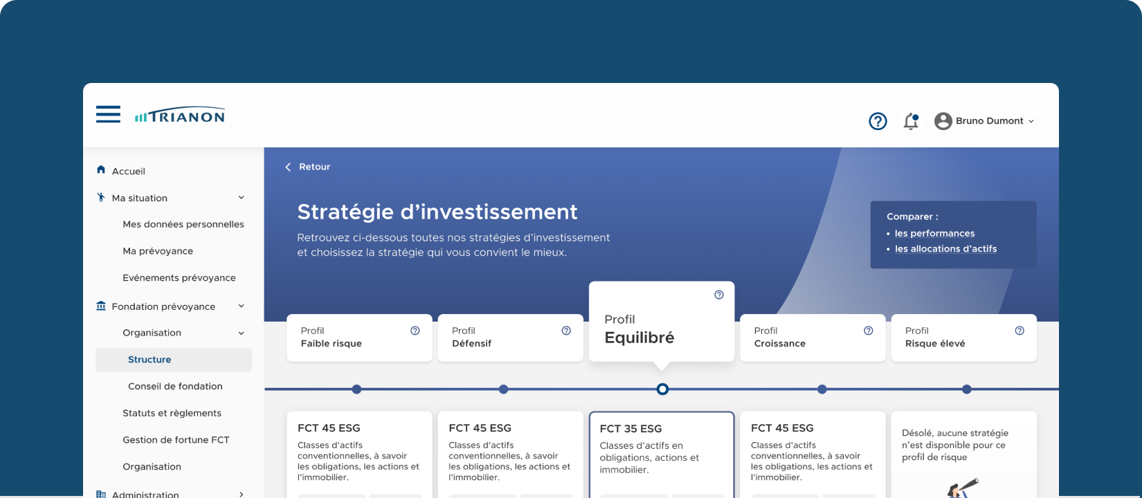
We carried out dedicated work on the module’s visual language to reconcile Trianon’s requirements with those of its main client. The objective: an interface that feels clear, reassuring and aligned with sector expectations.
A smooth experience builds trust and makes decision-making easier.
Key Benefits
Better understanding for insured members
A clearer module that helps users better understand how their assets evolve and what actions are available.
A simpler, more intuitive experience
Clarified journeys and optimised interactions that reduce friction and increase member autonomy.
Stronger UX momentum at Trianon
Strong buy-in to the UX/UI approach, opening the door to growing UX maturity.